Tinder is the most popular and most innovative dating app of all time. It’s a cultural phenomenon that’s achieved meteoric success in just five years. In 2017, Tinder was valued at $3 billion. It earns about $2,336,026 per day.
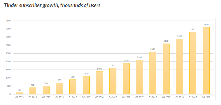
We don’t know exactly how many people use Tinder, though estimates put it around 50 million. According to Yahoo Finance, 4.1 million are paying subscribers.
Tinder is so financially successful that its parent company - Match Group - reported better-than-expected results in the first quarter of 2018. They raised their full-year guidance that year by $100 million, primarily due to Tinder’s growth.
“We’re seeing that Tinder subscribers both Gold and Plus are willing to pay for additional features if those features improve the chances to connect with someone,” says Mandy Ginsberg, CEO of Match Group (Tinder’s parent company).
So how did Tinder become the top grossing dating app and one of the top grossing apps of all time?
By applying some of the principles of F2P monetization to their model. They’ve found a way to “game-ify” online dating to create an engaging experience that’s more than just a means to end.
In this article, I’m going to cover how Tinder uses F2P monetization to dominate the online dating scene and sustain powerful revenue.
But before we dive into Tinder’s monetization strategy, let’s go over how they make money.
How Tinder Makes Money
The Tinder base app is free to use with limited features. The company began charging users in March 2015 when they introduced Tinder Plus. Tinder makes a majority of its revenue through Tinder Plus.
Tinder Plus is a subscription service that extends some features and gives you access to others. It costs $10/month for users under 30 years old and $20/month for users over 30. There are some variations depending on where you live in the world.
Here’s what you get:
Unlimited right-swipes: You can right-swipe (which “likes”) other users as often as you like.
(Without Tinder Plus, your right-swiping is limited. The limit is different for everyone based on your age, location, gender, and how you use the app. For most people, the limit is 50-100 right-swipes per 12-hour period.)
Super Like: Notify another user that you like them. If your profile appears on the liked person’s profile as a suggested match, your face will be highlighted with a star icon. Free users can Super Like once per day. Premium users can Super Like five times each day.
Rewind: This feature lets you undo a past action. For instance, if you recently Super Liked someone, but later decided to take away, you would simply Rewind that action. This only works on your previous action.
Passport: This is a unique feature that lets you change your geographical location without actually going there. This way you can look to meet up with people at a place you’ll be in the future or simply explore people in another area.
Boost: Boosting your profile makes you the top profile in the area for 30 minutes. This gets you about 10X more profile views and 3X more matches. You get one Boost per month with Tinder Plus, but you can also buy them individually for $1.99 to $3.99 each (depending on demand and location).
Additionally, you can buy Tinder Gold, an exclusive paid service that gives you all the benefits of Tinder Plus as well as a feature called Likes You. This feature shows you how many likes you’ve received and by whom, and lets you like them back, dismiss their like, or view the person’s profile. This costs an additional $5/month.
Tinder also monetizes through Sponsored Profiles, which are ways for brands to advertise. The content blends into the interface, but it’s marked as sponsored. This form of monetization doesn’t relate to F2P games, but I didn’t want to leave it out.
How Tinder Uses F2P Monetization
Tinder borrows four components of F2P monetization to drive their revenue:
1. Core Loop
A F2P game’s core loop is a cycle of actions, rewards, and progress. A player might kill monsters (action), earn diamonds (reward), and level up (progress).
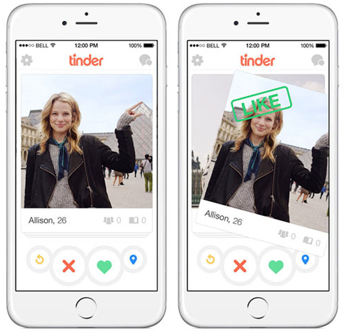
Tinder has its own loop, just like a game. The primary action in Tinder is swiping through potential matches. Swipe right to like them or left to reject them. If two people swipe right on each other, that’s a match - the reward.
Progress depends on the user’s goals. A user might consider progress to be a pleasant conversation, a meetup, or a full-on relationship. In some cases, users might simply enjoy browsing profiles of nearby people (some profiles are hilarious).
Swiping is a simple behavior, but highly engaging. In a lot of ways, swiping through Tinder is like pulling the lever of a slot machine, which psychiatrists say triggers chemical changes in the brain by activating the same brain pathways as drug and alcohol cravings.
Like slot machines, Tinder’s form of “gambling” is simple and easy to understand. There are no complex rules or big bets. All you risk by swiping is time.
In that context, dragging your finger across your screen for the possibility of meeting someone new is a pretty good deal, so there’s a lot of excitement behind each swipe and a big draw to pay the $10/month to swipe a lot more.
We can tell that people enjoy the loop because Tinder has one of the lowest one-week churn rates of any dating app:
Image: medium.com
2. Regular Rewards
Like I said before, the act of swiping creates a thrill that functions as its own reward. This means users feel rewarded every time they participate in the app’s primary activity. There’s very little to work for.
Since users get pleasure from swiping, they do it quickly. Many users use up their swipes quickly each day in a single session, which forces them to decide whether they should purchase Tinder Plus to unlock more swiping.
This is no different than building your in-game store into your loop. If you want people to make purchases, you have to get them in the store. By compelling users to consume their rewards and hit their limit every day, Tinder improves the chances of conversions.
3. Limited Resources
As you know, limiting resources is a fundamental principle of freemium games. If the user can’t get all the resources they need in a reasonable time, they might pay for more.
Tinder limits resources in two ways: It limits the number of times you can swipe in a 12-hour period and it prevents you from using other features that would improve your experience with the app.
Preventing users from swiping - the app’s primary activity - is pretty bold. There’s a hard stop on how much they can use the app’s basic version. This creates two potential outcomes.
The user purchases Tinder Plus, Gold, or a one-time Boost.
The user lowers their standards in order to match with more people before expending all of their swipes. A match is required for the user to meet their goal (conversation, meetup, relationship, etc.), so more matches means more value for the user, and a higher chance they’ll purchase a Tinder subscription in the future.
Obviously both outcomes are good for Tinder.
4. Social Elements
There’s no doubt that social elements are important components of F2P game design. Social sharing, inviting, and cooperation are powerful tools for organic growth.
Social sharing is also a great way to drive down your customer acquisition cost. Each user who signs up via a friend’s Facebook post is one less ad click you have to pay for.
Tinder is an inherently social app. That’s the whole point. Users are already primed to leverage app activities into relationships in another medium, whether that’s via text, on another platform, or in person.
Which means they didn’t have to shoe-horn in a social feature that doesn’t make sense in the context of the app. There’s no need for a screen that says “You get five stars! Share your achievement on Facebook!” because using the app normally is social.
How does Tinder’s social nature affect growth? When this happens:
“So where did you two meet?” “Oh, we met on Tinder.”
5. Engaging UX
This isn’t really a monetization strategy, but it is a technique borrowed from games, so I think it’s important.
Swiping on a phone obviously isn’t new. The gesture was available well before Tinder, but it was mostly used in active-type apps, such as games.
By incorporating the swipe gesture into a dating app (where a simple “next” button or link would suffice), Tinder created the feeling of activity, motion, and progress. You don’t just manipulate an app’s interface. You actively look through a crowd of people.
This creates a much more tangible experience and adds a sense of realism to the process. It doesn’t have the same artificial feel as other dating apps or websites.
This also circles back to the slot machine mechanic. At the slots, you have to do something to make the wheels spin and get that rush of excitement.
Even slot machines that let you play by pressing buttons still have the lever on the side. Some people really need that motion to feel like they’re participating in the activity.
Put all of these things together: The excitement of swiping, the feeling of doing something real, and the possibility of creating serious change in your life. That’s a recipe for engagement, which makes it much easier to convince users to purchase additional features.
What Does This Tell Us?
This little case study shows that the principles of F2P monetization are applicable to more than just mobile games. They work in most industries because they’re fundamental to human psychology. They leverage rewards, progress, and engagement to create a system where users eventually convince themselves they would get more value by opening their wallets.
Featured image: Urban Isthmus / Flickr
Looking for more insight? Listen to Playmakers - The Game Industry Podcast
Practice and engaging interviews with the legends and leaders of the video game industry:


